The new Fishhook website just launched. See what we updated and how we're applying what we learned to our work with churches.
Don't you just love a fresh website? We get to help churches improve their communications tools and strategies every day. And we have a lot of fun doing it! But when it comes to our own tools, well, sometimes it can feel like the cobbler's kids have no shoes.
So last year we took a look at our website and felt like it was time for a refresh. We liked the way it told our story, but we wanted to streamline. We looked for opportunities to simplify the design, offer new functionality and programming and make it super simple for you to find the content that can make your job easier. And that's what we did.
While it took us 9 months (not the typical 10-15 weeks it takes us to create a new church website), we did it! And we learned a lot about each other in the process.
So, now that the dust has settled a bit, take a stroll through the new site. Here's a guide for what you'll find:
- Streamlined home page
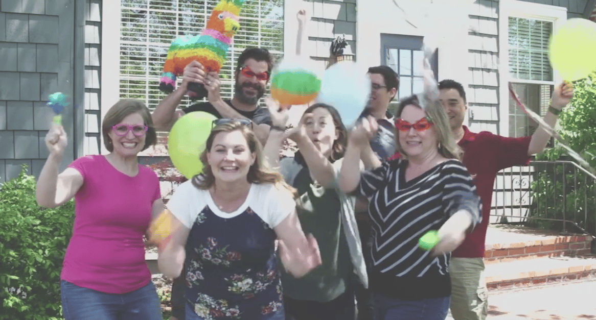
You'll see three sections. The first is the header area which shows our team and paints a picture of our mission. In the middle, you'll find 3 steps that make it clear how we typically partner with churches. Then, towards the bottom, you'll find the most recent episode of 'Hooked, which tells our story in a compelling video format.
- Revamped services page
We want it to be easy for you to see not only the bigger buckets of what we do, but also specific projects we've partnered with churches to launch. You'll also find a snapshot of the denominations we've worked with and a map showing where we've traveled.
- More visual portfolio section
We get asked all the time to see samples of our work. And while we've always had a section like this on our website, we wanted to be extra strategic about it. So you'll find highly visual portfolio pages that give more examples and mock-ups of our work. (Meredith - our lead graphic designer - says this is her favorite portfolio section we've ever had!)
- Unique team page
I, personally, love this page! At the top we tried something new with the programming to display our values in a unique way. Don't like the scrolling feature? That's ok! Just click the "Meet the Team" button and you'll slide right down. There, you can see who we are and read our bios.
- Reorganized learning hub
This section is really important to us. It's gotten a makeover from the old "Ideas and Resources" section. The biggest thing you'll notice is that we're no longer primarily filtering by what type of content it is (i.e. blog, podcast, video, etc.). We've created buckets based on specific topics. Then you can sort by whatever medium you prefer.
- New events page
Last, but certainly not least, is the events section! We're making learning events a big priority in 2018, hosting The Table three times a year in Indy and looking for opportunities to host free pop-up workshops across the country. So here you can check out what's coming up.
You'll probably also notice that we only have one level of navigation, instead of a full menu with multiple options. This was part of the streamline, and I'll tell you, I'm loving it! But more importantly, we hope you do too.
Any time we update the Fishhook website, we learn new programming skills, design strategies and a lot about ourselves. And we love applying all of these things to keep the websites we make for you fresh and functional.
We'd love to hear your feedback about the site! If you have something you love, a question, something you can't find, or an idea for the continued development of the site, let us know!
